Tuesday, 17 April 2012

Evaluation Question 4

How did you use media technologies in the construction, research, planning and evaluation stages?


GoAnimate.com: Media technologies by SawyerRyan


As mentioned in the video above, we used a whole range of technologies in the process of promoting our band, Fenech Soler. Without the use of these technologies the products wouldn't be able to compete with similar bands in the Indie Pop genre, they simply wouldn't look professional enough.

The internet
The use of 'Bubbl' to display our planning


The internet seems to be taken for granted today regarding the range of information you have at your fingertips when going online. In our research we used the internet to develop our knowledge on music videos, digipaks and album adverts. We also used websites such as bubbl to illustrate our planning in an aesthetically pleasing way.


At the start of the project we spent a lot of our time on Youtube watching some of the best music videos ever made and analysed them in our blog posts, most notably Eminem's video 'Stan'. With the access of the internet we could gather ideas from other music videos and apply them to our own video, we also went online to research the conventions of music videos. Without the knowledge of conventions of music videos we could make key mistakes in our video and ruin the chances of promoting the band well.


Throughout the project I recall using Wikipedia and artist's websites often to find out the smaller details about their work. For example we would find out where their videos were filmed and who directed the videos etc. Getting information from exemplary products was essential because the music industry was quite a new area for us at the start of the year. We couldn't just jump into making a music video without the analysis of some of the top music videos.
Screenshot of Google Images search


Google images was another usage of the internet which was used often in our project. I was constantly making searches online to see existing digipaks, album adverts, artist clothing and more images required for our planning stages. The use of google images is also a good way of comparing our work with professional work now that our work is complete.


In the construction of our ancillary tasks we used dafont to find ourselves suitable fonts to put on our digipak and magazine advert. We could have simply used a font off of Microsoft Word for example but because we wanted to make our products professional we found our own online. We ended up finding one font which suited our band perfectly and so we used it on both the digipak and advert.

The internet also gives us access to use fun ideas in our evaluation questions, like the animation I created at the start of this very question with goanimate. The internet is so broad these days that there is so many ways in which we can present out work.

Last but certainly not least the internet gives us access to the wonderful blogger. Blogger is such an easy way to present school work on compared to using paper and work folders. We can access Blogger from pretty much anywhere and there is no hassle of keeping pages together, it is simply all on one website. Blogger allows us to use a range of technologies to present our work with the use of music and videos. Importantly, I think it's fair to say that it offers observers an enjoyable experience when reviewing our media work. The idea of presenting my work on a website gives me a sense of professionalism and makes me really care about the appearance and presentation of my work.

A collage created on Photoshop
Photoshop
Photoshop has been a great help in the composition of our media products. Without it our work would not be of the quality which it currently is now. We've used photoshop in all stages of our work, even for simple things like creating collages to merge a range of pictures into one image. Without access to photoshop we would have to paste every single picture separately in our posts, instead we've been able to just post them in one go. Collages are another nice way of displaying evidence of planning and research.


Motion Blur Effect for Digipak


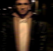
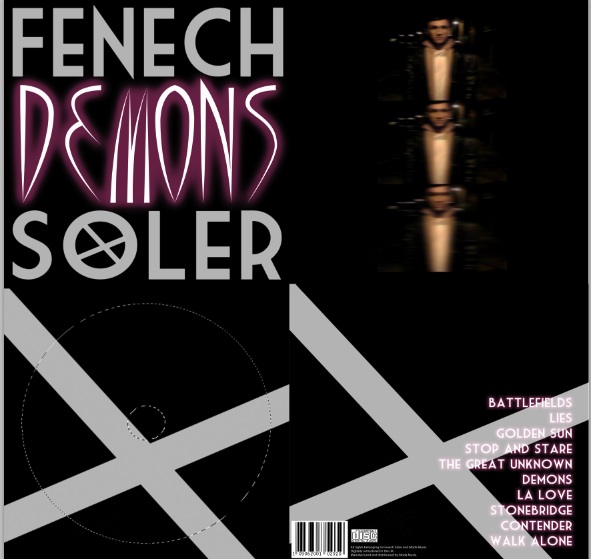
Photoshop has also been used in the construction stages of our promotional package. When we were choosing a picture to place in our digipak, we decided that we needed to do something a bit different with it rather than just putting a normal picture of the artist in the digipak. We tried many different effects before finding the one which we went on to use, we tried changing the colour scheme of the picture and also the Desaturation Tool. These ideas were all dismissed though. Where the chosen picture had a slight blurred look to it this gave us the inspiration to use the idea of the blurred effect further. We decided to use the same picture three times, and use the Motion Blur Effect on each one, making each one blurrier and blurrier. We wouldn't have been able to use this effect using another programme such as 'Paint'! We think this idea was different and looked interesting in our digipak.


Photoshop helped us to create a consistency in our products' colour scheme and house style. To use the same colours which we used in the digipak for the magazine advert we used the Eyedropper Tool. This tool allows you to simply click on the colour which you've been using and then use it somewhere else. We used this tool to get the colour from Taylor's hoodie and use it in one of our fonts.

In general, photoshop has been a brilliant technology to use for editing and playing around with images. The changes and editing you can perform on Photoshop give our products the professional look which we've hoped for. The creations you can make on Photoshop are endless, making Photoshop the best piece of kit we could have possibly used for editing photos.

Final Cut
Final Cut has been used in multiple stages of our media project. In planning stages we used Final Cut to construct our animatics, putting photos of our drawings to the audio file. Final Cut allowed us to drag different shots whcih we drew to the relevants part of the song, so the visuals matched the music to give people an idea as to how our final video will look.

We of course used Final Cut to construct our Final music video, Final Cut is the best programme we could have possibly used to edit our footage because there is no limit to what you can achieve with Final Cut. If we used another programme such as 'Windows Move Maker' our video wouldn't quite have the professional look we desired. Final Cut offers the use of a range of different transitions and effects, it allows you to change the speed of the footage and generally allows us to create a video which flows. Final Cut even allows you to apply text to the video, we used this to present the song and artist name at the start and the end of the video. Also, if the song pace increased we could simply cut down the size of our clips into shorter cuts, thus matching the pace of the editing with the pace of the song.

Screen-shot of Final Cut
I've also used Final Cut in the construction of one of my evaluation questions, this is a good way of presenting the work which I have done. Presenting work in the form of a video shows flexibiltiy to the people viewing my work.

Grabber
The use of Grabber should not go unnoticed in the planning and research stages of our promotional media package. Across all subjects at school, people assessing work are always looking for evidence, and grabber is a great and easy way of showing evidence in the form of pictures. Grabber is an icon at the bottom of the Apple Mac screen, you simply just click on it, choose 'capture' and then drag the area to the size you want the screen-shot to be. Grabber allows you to take on-screen shots on the internet, whilst watching videos, on different programmes, on anything!

iPhones
Our iPhones have been a great way of completing work away from the computer screen. We have used iPhones for taking pictures of things like brainstorms and then simply emailing them to our computers. I've also used my iPhone to record my voice whilst reading out one of evaluation questions, again showing flexibilty in work presentation. iPhones were also used when filming interviews for feedback, an easy way to complete and upload my work. Without iPhones the ability to transfer work from our phones to our blog would be a ot more complex.


Evaluation Question 3

What have you learned from your audience feedback?


(Click enlarge button if text is difficult to read ^)

Carrying on from the presentation above, we also received some feedback after the products were completed. We tried using different media technologies to gain our feedback.

Firstly, I chose a few people from the sixth form to interview and film. The interview format allowed me to ask people specific questions to see how they would respond. The following are the questions which I asked them;
  • What did you enjoy about our Media products?
  • Regarding the music video, do you think the music matched the visuals well?
  • Do you think that our products promote the artist, Fenech Soler, well?
  • Do you think our main actor, Taylor, played the part well?
  • Looking at all three products, the video, the digipak and the advert...do you think they combine together well?
  • What could we do to improve our products?
After filming the interviews I've watched them a few times whilst taking notes to see what sort of feedback we received. In general it would seem that our products went down very well and the responses have shown that the magazine advert seems to be the most popular product out of the three. Some notable quotes which spring to mind regarding the magazine advert was that it's 'unreal' and 'superb'. There was also comments praising our design across the three products because they all combine together well with the fonts and colour schemes. The use of bright colours on the advert and digipak went down well because it is eye catching for customers in shops, and also the products were said to be very promotive of our band because the fonts are nice and big bringing out the artist's name. We was also complimented for the similarities between the two ancillary tasks because it is seen in the real music industry where the album advert is closel linked to the album itself. One said that they realy enjoyed the idea of using Brighton to film some of the video in because it goes well with the mood of the song and band.Another said that they liked the use of flashback in our music video because it refreshes the viewer's memory of what has happened. The acting in our video was also praised, it was said to look natural to Taylor and that he showed the emotions with ease.

However, it wasn't all positives. There were comments remarked about some of our camera-work being a bit shaky so that is something we can learn from. Perhaps we should make more use of the camera-stand in future. Other negatives weres that we should have used brighter colours in our video to match the two ancillary tasks more, a lot of the shots are dark so next time we can use a more variety of shots in terms of lighting. With the digipak some said that there could be more on the front cover because it looks a bit plain. One even said that we maybe should have used a picture on the front cover instead, but he did say that our design goes with our other products well. Lastly, one person said that some of Taylor's acting was unconvincing. The person said that he appeared to be laughing in some scenes, this isn't professional because our song and products have a serious meaning behind them. Next time we could keep retaking the shots which were unconvincing until the acting looked professional and natural.

how to make an animated gif
Interview process


I also constructed a short survey using Survey Monkey and posted  it on social networking sites with a link to our work posted with it. By doing this I would hopefully get a wide range of responses from a variety of people. Here is a screen shot of the survey I made...


Feedback Survey

The survey responses were brilliant and really complimentary of our work. Every respondent either chose 'strongly agree' or 'agree' for the first five questions which was extremely positive feedback, these responses teach us that we ticked all the boxes required. The survey results also showed us that the most popular products were both the music video and the magazine advert with an equal amount of votes each. The digipak didn't get a single vote and so from this we learnt that we should spend more time on our digipak design if we were to do it again because each product is as important as one another. The last question on the survey allowed the resondents to leave a comment for their answer for points for improvement. We learnt the most from this question. One answer mentioned that we should add more detail to the front cover of our digipak and another said that we could have used a picture for it instead of purely text. We also learnt that we could put more information about the artist in our advert as this was another criticism we've received from the survey. There was also an opinion expressed about the music video saying that although he/she enjoyed our video he/she would have preferred a performance based video even more, this is something else for us to consider. Lastly, there was a comment about our filming not being very professional.

Summary
As you can you see from this blog post we have collected a range of feedback through our promotional media package construction process, and there was a few points for improvement which kept reoccuring through our results. Firstly, there was numerous mentions about our camera-work. To correct this in the future we should spend time practising our filming before jumping into the task unexperienced. There was also a lot of criticism about our lack of detail on our digipak. From this we've learnt that we should spend an equal amount of time working on each product because they should all be as consistently good as one another. If we was to do it again we would consider using a picture on our front cover because this is what many people have suggested. Then lastly we received a lot of negative feedback on how dark our video is, although we purposely planned to use low key lighting to suit the mood of the song we would certainly consider using a more brighter shots. Brighter shots are more aesthetically pleasing to the viewer and they would also help our video combine better with our two ancillary tasks. However, overall our feedback was very positive and complimentary. The audience were particularly impressed with how well the three products combined together with the same colour scheme and fonts.

Evaluation Question 2

How effective is the combination of your main product and ancillary texts?

Adding to what my friend has just said there above, there's plenty of evidence of combination between the three products in our project. To back up what he's just said here's an image to show you what he's been talking about...

Colour scheme and House style
Above is a picture of our two ancillary tasks side by side, the digipak and the magazine advert. As you can see they go well as a pair. The only colours used are black, white and red and the fonts used on both products are the same. As you can see we decided to create our own font online which is now Fenech Soler's own trademark font, therefore this would be the font used on all their other merchandise as well. Also the picture you can see on both of the products is a shot from our music video and so the target audience will be able to quickly identify the person in the advert from watching the video. The fact that Taylor is alone in the picture is significant because it indicates the trouble his 'demons' have put him through, and also the picture resembles Taylor's isolation he suffers in the video.

The idea of identification is very important for the target audience because as fans of the band they should quickly be able to identify that it is Fenech Soler being advertised, or that it's Fenech Soler being sold on the shop shelf, or it's Fenech Soler being played on the music channel! Once they've seen one of these products they should instantly realise that the other products are Fenech Soler's as well.

We chose to use a blurred image on the products because we felt it related well to the confusion his drugs and 'Demons' cause him in the music video. Also see that the colour of his hoodie which he wears in the video is the same colour we've used for some of our fonts, again cross-linking the products.

We've even created our own logo which is within our Fenech Soler font being the 'x' symbol. Again this is something which features on both ancillary tasks and so the public will be able to identify each product through the use of a logo. See the logo featured across our media package below...
Evidence of 'X' logo used throughout
Regarding the filming of our music video we ensured that our filming took place at night time to add to the edgy atmosphere of the song and video. The low key lighting in our video combines well with the dark colour scheme we've used to construct the two anciallry tasks. Together the dark colour scheme across the three products brings out the gloomy mood of the song and emphasises on the 'Demons'.

Diagram highlighting evidence of combination

Evaluation Question 1

1. In what ways does your media product use, develop or challenge forms and conventions of real media products?


Feedback

Final Music Video Feedback

To gain feedback for our music video we decided to publicise our video on facebook. Ellis posted the video onto her account and these are some of comments she received back...


Thursday, 15 March 2012

Final Magazine Advert


Here is the finished product, the magazine advert. We think our advert ticks all the boxes regarding the promotion of the band, and it's easy to identify who the band are. The picture of Taylor is recognisable from the music video which the audience would have seen on music channels and we have presented the band name very clearly in a biggest font on the poster.


Below I've managed to create an idea of what our music advert would look like in a real music magazine and I think it fits in perfectly with all the other adverts. In fact, it's hard to tell which one is a fake advert.
It's just a real advert right?

Magazine Advert Construction

The picture which reoccurs through our products
As mentioned in the previous post, the first thing we did was import the picture we was going to use into photoshop and then simply build up the poster on top of it. The picture we're using is the same which appears in the digipak, so straight away the target audience will notice similarities between the three promotional products. The picture we are using has actually been criticised by some of our peers because they say it isn't a clear enough picture, but this isn't what we are looking for. With our slightly edgy music genre we have decided to our products slightly different, hence the blurred picture we are using. We think this makes our advert more unique, compared to other adverts which simply use photo-shoot pictures. The blurriness portrays the difficulties and confusion Taylor has gone through, whilst experiencing his 'Demons' or drugs.

The next most important thing was the fonts and making sure that the bands name is the first thing a reader sees. We decided to use the same font we used on the digipak as this is Fenech Soler's very own font which they use on all their products. The target audience will recognise this straight away and so will be drawn straight to the advert. Just like we did with the digipak we placed 'Fenech' and 'Soler' at either end of the product, this shows consistency in the products' style.

The 'Fenech Soler' font
For the rest of the text we put on the advert we used the same font which used for the album title 'Demons' on the front of our digipak. The colour of this font goes really well with Taylor's hoodie and so the colour scheme of the advert all matches well, creating a dark atmosphere about the album.

When  a reader sees the advert in the magazine the first thing they are going to want to know is when the album is available and so we've achieved this by informing the public that it is currently available to download on itunes. To promote the band further we placed the band's website on the advert, this could lead to further revenue for the band because you can find the band's merchandise on the website. This is known as 'add-on sales' in the world of retail.

Lastly, we learnt from competing bands and artists that they place album reviews on their adverts to boast how good the feedback they've received is. therefore we placed a four star rating on our advert from 'NME' a popular music magazine, this going to make the public want to buy it because they now know it's worth buying.

For more information and band merchandise
When can you buy it?

Album rating


Magazine Advert Planning

The main purpose of the magazine advert is to raise awareness of it's release. Fans are going to be dying to find out when the album comes out and so the advert is there to inform all the fans of this information. Also the advert has to promote the artist and so these are the things which we have to bear in mind before constructing our advert.

We plan to put on the advert a rating from an album review from a respected brand in music so the public know that it is worth buying and also the date in which the album is available to buy. We are also going to place Fenech Soler's web address on the advert so the public can find out more about them and promote them even further.

Regarding the design, we need to make it similar to our Digipak's house style so the public can quickly link the two together. Therefore we will stick to the same dark colour scheme and use same fonts we created. The first thing the reader of the magazine is going to notice is the picture, we are going to use the same picture we used in the digipak. This picture of Taylor is clearly from the video so a customer will quickly be able to recognise him from the video and hopefully want to buy the album because of this.

We will create the advert using Photoshop. Firstly, we will import the picture into Photoshop and we can have this as our fixed base layer. We can then work on all the text layers over this.


Final Digipak


Here's the complete four panels of our final digipak. As you can see the four panels all go well together with the colour scheme all matching. As planned the CD is very dark which relates to the 'Demons' and the dark background behind the album and the artist's life.

Below is a photo I've taken with a group of professional CDs, ours is also amongst them. I think that it is fair to say that our's looks as professional as the others and you wouldn't look twice if you saw it on the shelf of a music store.

Which one is the piece of school work?!


Digipak Construction

Front Cover
We decided to keep the front cover simple but effective. Using big font to attract the attention of customers and turn them customers into buyers. We chose to use a black background to represent the darkness of the 'Demons' and use white coloured font for 'Fenech Soler'. The white font will show clearly on the black background so it will be easy to identify on the music store's shelf, but not only this it also represents hope. Although Taylor, the lead vocalist of Fenech Soler and also the charcter in our video has been through dark times (black background) his music and his band gives him hope for the future (white font). As planned we found our font on the dafont website, however we found it difficult to find one which stood out and looked distinctive. So Ellis came up of the idea to pick a font and slightly adapt it using photoshop. We found ourselves a bold looking font and then Ellis put a cross shape inside the 'o' of 'Soler' as a way of showing that it is Fenech Soler's trademark font, almost like a logo. This can now feature in the rest of our media production.

Fenech Soler symbol

For the album title 'Demons' we decided to find a evil and twisted looking font. We chose to use the dark red colour because this is the colour of the hoody he wears in the video of 'Demons', achieving the consistent house style we desired.


Finally, instead of going for the conventional look of a digipak front cover we decided to go for an alternative style by placing the title' 'Demons' in between each word of our band name. This alternative choice is similar to Fenech Soler's style of music and so I think it will please the target audience.


Front Cover complete


Inside Cover
We decided that the inside cover would be where the image of our artist would be, Taylor. Then it was decision time between having a professional-style photoshoot or simply take a shot out of the video. There were benefits for both of these choices but we felt that a photoshoot isn't likely to occur in the Indie-pop culture. So we looked for a pictue in our video simply by watching the video over and over again. These were all the candidates:

Ideas for inside cover picture


All of these photos are quite similar and each one could probably fit in a Fenech Soler digipak. They each identify who the artist is and also indicate some of the difficulties and pain he's going through. However, the one which did it for us was the one with the star. It's actually the most unclear picture out of the 4 but we feel that the blurred effect it has portrays Taylor's confusion and the blurred outlook he currently had on life.

We thought that the picture alone looked a bit boring so we needed to decide what effect we wanted to place on it. The first thing which sprung to mind was to desaturate it.....

This idea was dismissed, too unclear

However, we thought that this didn't leave the picture with much clarity because the picture was already blurred.So we needed to think up of something a bit unique, something which can relate directly to Taylor and his album 'Demons'. So we came up of the idea of blurring the picture even further to emphasise on his complex life further. Then it came to us that we would have more than one copy of the picture but getting clightly more blurred each time. This again is different and alternative like Fenech Soler's music.


Inside Cover complete


Inside Cover with disc 
We kept this panel nice and simple keeping the same colour scheme for it and house style. We decided to use the symbol Ellis created for Fenech Soler to put on this panel. The symbol also goes over the disc as well so if it's taken out the symbol is incomplete. 

Inside disc panel complete

Back Cover

Tracklist
The back cover of a digipak has to show the buyer what songs feature in the album most importantly. We aligned the list to the right.We decided to use the same font which we used for 'Demons' on the front cover for the tracklist. This keeps the house style consistent through all four panels, we also chose to use the black background once again.
Something else which is important on a digipak is a barcode, because this shows that it is professional and real. We decided to place the barcode on the back cover along with the production and copyright details. Finally, we placed the cross symbol on the back cover as well so the target audience can identify it easily.


Barcode, copyright and production details

Back Cover complete

Digipak planning

The digipak is vitally important for our band's promotion because the design represents the whole of their work. To maintain a consistent house style in all three of our products we are going to use dark colours for our digipak, relating to the 'Demons'...the name of the album and the single from our music video.


It's also important to get a picture of our artist in the digipak and so we're unsure at the moment as to whether we are going to do a photoshoot with Taylor or simply take a shot out of our video of Taylor which is suitable. Where the album 'Demons' is about Taylor's past drug addiction we are going to make the digipak gloomy and melancholic, so the target audience can relate to the dark place Taylor (lead vocalist of Fenech Soler) once was.


We need to find ourselves a 'Fenech Soler font' which is going to feature on both the digipak and the magazine advert. We will use the dafont website which we used for our magazine front covers last year to find a distinctive font which is suitable for Fenech Soler's style.


To ensure that our digipak looks as professional as possible we must include every single detail in which we've seen on exemplary products. On the back cover we are going to place a barcode and also the production details to make it look realistic.


The best way to construct our digipak is going to be by doing it a panel at a time. Firstly, we'll work on the front cover, then both inside panels and then lastly the back cover. The front cover is going to be done first so that once we have completed that we can use ideas from the front ocver to complete the rest of the digipak.

Tuesday, 13 March 2012

Meanwhile...Final Cut Music Video Complete


Untitled from Ryan Sawyer on Vimeo.

And here it is, the final cut. From now on we'll be showing the video to as many people as possible to gain as much feedback as we can. The more feedback we receive, the easier our evalution stage should be.

Thursday, 8 March 2012

Album Magazine Adverts compared to their Digipaks

Ellie Goulding - Lights
As you can see from the image to the right both products look very similar, mostly because the same picture is used for both. The advert promotes the album very effectively because the target audience can easily identify who the artist is from a distance and gain an idea to what the album is going to look like. The font used is exactly the same, it's the biggest piece of text on the advert and therefore the reader is going to know who the advert is in relation to immediately. Otherwise they could just turn the page before they read it properly. In smaller text below 'Ellie Goulding - Lights' there are quotes from album reviews and this in a way is the artist's evidence that the album is worth buying. The positive reviews are going to attract more buyers (click to enlarge the image).

Two Door Cinema Club - Tourist History
Again both products look very similar with the same picture and fonts used for both. Across the top of the advert the artist name is clearly displayed in the artist's own trademark font. Beneath this and the album title it states that the album is out now and it makes it clear that it is their 'debut album' so it could appeal to anyone. It also lists a number of their hit tracks which feature on the album allowing the public to link the songs to the band/album. One song in that list could be the difference between someone buying it or not. A very clever piece of marketing shown on the advert is how they've listed all the gigs that they are playing at along the bottom and then over the top wrote 'SOLD OUT' in bold font. This shows the public that they are a successful band and that they are popular, so it's worth buying the album.


Florence and the Machine - Lungs
 As you can see on the right the advert promotes the album perfectly with the same image being used on both products. The picture is of Florence herself and so the customer will be able to identify the artist very swiftly. Like we've seen before the fonts are also the same between advert and album showing a direct comparison between the two. The writing on the advert is white on a black background so therefore the text is very clear for the public to see. The most important piece of information is along the top, being the artists name and this is in the font which Florence and the Machine always use, appealing to the target audience. Below the album name is the release date informing the target audience how long they have got to wait before they can purchase it. In smaller text it then states a few of her more popular songs which feature on the album, letting the public know what they can expect when they get their hands on the album. Lastly, in a slightly bigger font it says what forms you can buy the album in, like 'vinyl' or 'CD' for example. This informs the public that the album is aimed at a wide range of people.

Album Magazine Advert

The magazine advert needs to promote the artist's music and create excitement for the target audience. It must showcase the release date for the album because then the public know how long they have to wait until they can rush down to the nearest store to buy a copy. It also needs to display quotes from album reviews and album ratings, like ' **** - A Phenomenal Piece of Work' for example! Most importantly it should highlight the artist's name and the album title, so the public know what they are looking out for. To make the advert stand out in a magazine it needs to have an eye-catching picture, typically a picture of the artist. We need to decide whether we are going to have a photoshoot for the magazine advert or use one which we've used for the album cover. Most commonly magazine adverts show the picture found on the album cover and this is what we're most likely to do.

Wednesday, 29 February 2012

Digipak - Existing Products


I went through the CD rack at home and searched for a few CDs I could analyse of a similar genre to our music. I took a picture of both the inside panels and the outside. Here's what I found....

Two Door Cinema Club - Tourist History
Admittedly the consistent house style isn't immediately evident in this digipak, but then you look closer and aspects of the design reoccur through different panels. The cat which we see on the front cover is very abstract and has know relevance to Two Door Cinema Club's music at all. However, weird and wonderful ideas are used in Indie music and that's why the fans love the music. The cat's eyes reoccur on the actual disc in the digipak showing some consistency in house style. In terms of colour scheme, two of the panels are white and the other two consist of dark colours and have a slightly fuzzy effect to them. Again this shows some consistency in house style. The font used for the cover is the font Two Door Cinema Club always use and this is a quick way to identify the band. The font reappears on the disc as well. On the back cover of the album like we see on the majority of albums there is a list of tracks which feature on the album. The font is Two Door Cinema Club's very own again and the text is centred.


Coldplay - Mylo Xyloto
The name of the album, 'Mylo Xyloto', has an unknown meaning, even Coldplay themselves haven't really made up a true meaning for it. Therefore this has given them the freedom to create wild and wonderful ideas for their album, there's no barriers as to what it can be about. Here the bright fluorescent colour scheme clearly boasts a consistent house style throughout. The use of bright colours is going to catch the customer's eye and also it's something the CD is going to be remembered for. The front cover has the album's name illustrated in a big bold font across the middle of it. The actual font design is distinctive and it occurs throughout the album, showing just the outlining of the letters. In the top left hand corner there is a sticker which informs the customer of a couple of the hit tracks it has on the album. This could make the difference in a customer wanting to buy it or not. The back cover lists the tracks from the album where the text is centred and in the font we see on he front cover. The inside cover show's the initials of the album name which again reminds the public of it's identity.


 Kasabian - Velociraptor
This album clearly has a consistent black and white colour scheme running through it. The album name is 'Velociraptor', the name of a dinosaur, this idea of dinosaurs is shown on most panels of the digipak. The front cover shows four cavemen screaming. This links to the dinosaur age theme, where cavemen would have been terrified of the dinosaurs. The idea that there is four of them makes me think that each one represents each band member as there are four people in Kasabian. The name of the album is presented just below the band name on the front cover but upside down, as in a mirror effect. This is used on the back cover aswell, below the list of tracks is an upside down picture of the band. I think this picture of the band is important because it reminds the customer of who's actually produced the music. The inside panel shows what appears to be another caveman like character walking a dinosaur on reigns, supposedly the Velociraptor? When I first looked at the disc to the digipak I just thought it had a pattern on it but if you look closely there are four faces screaming on it in the same positions as the cavemen are on the front cover.


Thursday, 23 February 2012

Digipak - Research

So what is the importance of the Digipak?
The cover of the Digipak is the first thing the customers are going to see when they walk into the music store and so it must be able to catch the eye of any potential buyers. The cover must represent the artist and also give the public an idea of the genre of music they'll find when they buy the music. The picture on the front of the album isn't just going to be on the CD, it will be seen in magazines, on t-shirts, on the internet and on television. This means that it's vital to get the cover right first time and make sure that it represents everything about the band and the music. The colour scheme and house style must be consistent through all four panels of the digipak. For our media products we''ll be looking to use dark colours because the majority of our music video is filmed at night time.


What design do we put on the cover?
Looking at existing products from our genre of music it seems that half have computer animated images/cartoons on the cover and half have photos. Something they all have in common is that they're all abstract and slightly edgy, this reflects the music genre. We are thinking of taking a screenshot out of our music video and editing it using photoshop. This way there will be clear coherence between all of our media products, this is essential.


Are the other three panels even important?
When I first heard about this part of the project this question came to mind, but now I've realised that this is a silly question. If the other three panels didn't matter then you would have a lot of disappointed customers when they buy and open the CD. The back cover and both inside panels must share the same house style and themes as the front cover so the audience have a way of identifying the album (eg. the fluorescent CD or the desaturated CD). The inside panels is where the audience are going to actually find the CD so they will pay attention to the designs as they pluck the CD from the "teeth" of the hub which secures the disc in place.

Tuesday, 21 February 2012

Digipak - Research

I've looked on the internet for Fenech Soler album covers and single covers for inspiration when we come to making our digipak. From the collage you can see that they all share similar characteristics, they all seem to have triangular shapes on them and the font is the same for most. We'll have to consider this when we make our digipak although these look hard to recreate.

We were thinking of using a photo but these all look like computer animated images. However, if this is what pleases the target audience then this is the route we'll have to consider taking. To produce our digipak we'll be using Photoshop.

Wednesday, 8 February 2012

Plan of Action

After receiving our feedback Ellis, Bethan and myself have had a brainstorm as to how we can make big improvements to our video. The thing that really hit home for us was that we need to add something a bit different to the middle part of our video. We think we've come up with just the right idea to really bring the 'Demons' out in our video...

Brainstorm

The whole boyfriend girlfriend break-up is still the main idea in our video but we've added this evil infant character to the story to really spice things up. Where before the middle part just consisted of Taylor walking around emotionally being all sad, we're now going to add hallucinations into it. This time Taylor is going to visualise a small and evil child leading him somewhere to show him what he thinks is his girlfriend with another boy. This is really going to trip him out and he only comes back to reality when he receives the 'it's over' text from his girlfriend. Like before he is going to run back home and knock on the door for his girlfriend. However, this time we'll see the girlfriend look out the window at him and then turn back in disgust, then following this the demon child will look through the curtains in the same spot. Is the demon child real or is it just a figure of the boyfriend's imagination??

The Demon
We plan to use Ellis's younger sister Gracie to play the evil infant and will have to come up with props and make up to make her look a bit twisted. This character is now the 'demon' which is constantly referred to throughout the song. This time round we're going to use a park in daylight to film the hallucinations in response to the comment that there was a lack of light in our rough cut.

Tuesday, 7 February 2012

Rough Cut - The Feedback

Feedback Sheets
Last Thursday the class watched everyone's rough cuts and we wrote down notes for improvement on each other's videos. When we got handed our feedback back we analysed the criticisms and worked together to identify what the most common points for improvement were.


  • A lot of people said that there was  a lack of colour is our shots and that some of the shots were too dark to see. 
  • Some said that some of our acting was unconvincing like the argument scene and the banging on the door.
  • Others said that our middle part was a bit boring, had too much walking around in it. Something else needs to happen, to create an edge to the video.
  • Also the video is broken up into three sections but they aren't divided up very evenly. Some said we need to lengthen the start and end a bit more.
  • Another comment we received was to involve the female character more and make it more clear as to who she actually is.
  • Lastly, we need to use a more variety of shots, more close ups in particular.


Rough Cut


And here it is, it's our rough cut. With all our filming we've managed to edit it down to a few minutes adding transitions and effects to add to the quality. Shortly we shall receive feedback from our class mates and work on our final cut from there.

Thursday, 26 January 2012

Thinking about...Ancillary Tasks


Briefs
1. A promotion package for the release of an album, to include a music promo video, together with two of the following three options:
  • a website homepage for the band;
  • a cover for its release as part of the digipak (CD/DVD package);
  • a magazine advertisement for the digipak (CD/DVD package).
As our filming for the rough cut is at the halfway stage I've started to think about producing the two ancillary tasks. As you can see above we decided to eliminate the website homepage option for our band and go with the second two tasks. 


The digipak is very important for an artist because this is how they represent themselves and this is what listeners are going to picture in their head when they consider buying the CD. Also this gives the artist another chance to flaunt their style and genre. We must remember that all three parts of our promotion package must relate to one another in terms of things like fonts and colour scheme. The house style must be consistent in all three products.


The magazine advert is also vital because without advertisement the fans aren't going to know if the single is on sale or not. The advert must give fans a taster for the real digipak so they have an idea of what to expect. Significantly the advert is going to tell the public when the single is released and how much it's going to cost, without this the customer cannot be lured into buying it!