Showing posts with label Album Magazine Advert. Show all posts

Thursday, 15 March 2012

Magazine Advert Construction

The picture which reoccurs through our products
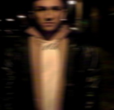
As mentioned in the previous post, the first thing we did was import the picture we was going to use into photoshop and then simply build up the poster on top of it. The picture we're using is the same which appears in the digipak, so straight away the target audience will notice similarities between the three promotional products. The picture we are using has actually been criticised by some of our peers because they say it isn't a clear enough picture, but this isn't what we are looking for. With our slightly edgy music genre we have decided to our products slightly different, hence the blurred picture we are using. We think this makes our advert more unique, compared to other adverts which simply use photo-shoot pictures. The blurriness portrays the difficulties and confusion Taylor has gone through, whilst experiencing his 'Demons' or drugs.

The next most important thing was the fonts and making sure that the bands name is the first thing a reader sees. We decided to use the same font we used on the digipak as this is Fenech Soler's very own font which they use on all their products. The target audience will recognise this straight away and so will be drawn straight to the advert. Just like we did with the digipak we placed 'Fenech' and 'Soler' at either end of the product, this shows consistency in the products' style.

The 'Fenech Soler' font
For the rest of the text we put on the advert we used the same font which used for the album title 'Demons' on the front of our digipak. The colour of this font goes really well with Taylor's hoodie and so the colour scheme of the advert all matches well, creating a dark atmosphere about the album.

When  a reader sees the advert in the magazine the first thing they are going to want to know is when the album is available and so we've achieved this by informing the public that it is currently available to download on itunes. To promote the band further we placed the band's website on the advert, this could lead to further revenue for the band because you can find the band's merchandise on the website. This is known as 'add-on sales' in the world of retail.

Lastly, we learnt from competing bands and artists that they place album reviews on their adverts to boast how good the feedback they've received is. therefore we placed a four star rating on our advert from 'NME' a popular music magazine, this going to make the public want to buy it because they now know it's worth buying.

For more information and band merchandise
When can you buy it?

Album rating


Thursday, 8 March 2012

Album Magazine Adverts compared to their Digipaks

Ellie Goulding - Lights
As you can see from the image to the right both products look very similar, mostly because the same picture is used for both. The advert promotes the album very effectively because the target audience can easily identify who the artist is from a distance and gain an idea to what the album is going to look like. The font used is exactly the same, it's the biggest piece of text on the advert and therefore the reader is going to know who the advert is in relation to immediately. Otherwise they could just turn the page before they read it properly. In smaller text below 'Ellie Goulding - Lights' there are quotes from album reviews and this in a way is the artist's evidence that the album is worth buying. The positive reviews are going to attract more buyers (click to enlarge the image).

Two Door Cinema Club - Tourist History
Again both products look very similar with the same picture and fonts used for both. Across the top of the advert the artist name is clearly displayed in the artist's own trademark font. Beneath this and the album title it states that the album is out now and it makes it clear that it is their 'debut album' so it could appeal to anyone. It also lists a number of their hit tracks which feature on the album allowing the public to link the songs to the band/album. One song in that list could be the difference between someone buying it or not. A very clever piece of marketing shown on the advert is how they've listed all the gigs that they are playing at along the bottom and then over the top wrote 'SOLD OUT' in bold font. This shows the public that they are a successful band and that they are popular, so it's worth buying the album.


Florence and the Machine - Lungs
 As you can see on the right the advert promotes the album perfectly with the same image being used on both products. The picture is of Florence herself and so the customer will be able to identify the artist very swiftly. Like we've seen before the fonts are also the same between advert and album showing a direct comparison between the two. The writing on the advert is white on a black background so therefore the text is very clear for the public to see. The most important piece of information is along the top, being the artists name and this is in the font which Florence and the Machine always use, appealing to the target audience. Below the album name is the release date informing the target audience how long they have got to wait before they can purchase it. In smaller text it then states a few of her more popular songs which feature on the album, letting the public know what they can expect when they get their hands on the album. Lastly, in a slightly bigger font it says what forms you can buy the album in, like 'vinyl' or 'CD' for example. This informs the public that the album is aimed at a wide range of people.
Album Magazine Advert

The magazine advert needs to promote the artist's music and create excitement for the target audience. It must showcase the release date for the album because then the public know how long they have to wait until they can rush down to the nearest store to buy a copy. It also needs to display quotes from album reviews and album ratings, like ' **** - A Phenomenal Piece of Work' for example! Most importantly it should highlight the artist's name and the album title, so the public know what they are looking out for. To make the advert stand out in a magazine it needs to have an eye-catching picture, typically a picture of the artist. We need to decide whether we are going to have a photoshoot for the magazine advert or use one which we've used for the album cover. Most commonly magazine adverts show the picture found on the album cover and this is what we're most likely to do.
