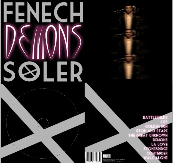
We decided to keep the front cover simple but effective. Using big font to attract the attention of customers and turn them customers into buyers. We chose to use a black background to represent the darkness of the 'Demons' and use white coloured font for 'Fenech Soler'. The white font will show clearly on the black background so it will be easy to identify on the music store's shelf, but not only this it also represents hope. Although Taylor, the lead vocalist of Fenech Soler and also the charcter in our video has been through dark times (black background) his music and his band gives him hope for the future (white font). As planned we found our font on the dafont website, however we found it difficult to find one which stood out and looked distinctive. So Ellis came up of the idea to pick a font and slightly adapt it using photoshop. We found ourselves a bold looking font and then Ellis put a cross shape inside the 'o' of 'Soler' as a way of showing that it is Fenech Soler's trademark font, almost like a logo. This can now feature in the rest of our media production.
For the album title 'Demons' we decided to find a evil and twisted looking font. We chose to use the dark red colour because this is the colour of the hoody he wears in the video of 'Demons', achieving the consistent house style we desired.
Finally, instead of going for the conventional look of a digipak front cover we decided to go for an alternative style by placing the title' 'Demons' in between each word of our band name. This alternative choice is similar to Fenech Soler's style of music and so I think it will please the target audience.
 |
| Front Cover complete |
Inside Cover
We decided that the inside cover would be where the image of our artist would be, Taylor. Then it was decision time between having a professional-style photoshoot or simply take a shot out of the video. There were benefits for both of these choices but we felt that a photoshoot isn't likely to occur in the Indie-pop culture. So we looked for a pictue in our video simply by watching the video over and over again. These were all the candidates:
 |
| Ideas for inside cover picture |
All of these photos are quite similar and each one could probably fit in a Fenech Soler digipak. They each identify who the artist is and also indicate some of the difficulties and pain he's going through. However, the one which did it for us was the one with the star. It's actually the most unclear picture out of the 4 but we feel that the blurred effect it has portrays Taylor's confusion and the blurred outlook he currently had on life.
We thought that the picture alone looked a bit boring so we needed to decide what effect we wanted to place on it. The first thing which sprung to mind was to desaturate it.....
.jpg) |
| This idea was dismissed, too unclear |
However, we thought that this didn't leave the picture with much clarity because the picture was already blurred.So we needed to think up of something a bit unique, something which can relate directly to Taylor and his album 'Demons'. So we came up of the idea of blurring the picture even further to emphasise on his complex life further. Then it came to us that we would have more than one copy of the picture but getting clightly more blurred each time. This again is different and alternative like Fenech Soler's music.
 |
Inside Cover complete
Inside Cover with disc
We kept this panel nice and simple keeping the same colour scheme for it and house style. We decided to use the symbol Ellis created for Fenech Soler to put on this panel. The symbol also goes over the disc as well so if it's taken out the symbol is incomplete.
|
 |
| Inside disc panel complete |
Back Cover
 |
| Tracklist |
The back cover of a digipak has to show the buyer what songs feature in the album most importantly. We aligned the list to the right.We decided to use the same font which we used for 'Demons' on the front cover for the tracklist. This keeps the house style consistent through all four panels, we also chose to use the black background once again.
Something else which is important on a digipak is a barcode, because this shows that it is professional and real. We decided to place the barcode on the back cover along with the production and copyright details. Finally, we placed the cross symbol on the back cover as well so the target audience can identify it easily.
 |
| Barcode, copyright and production details |
 |
| Back Cover complete |